Zero Salon App
Case Summary
Client
Lightors Co., Ltd.
Industry
Environment and ESG, plastic cup recycling
Period
April 2025 – April 2026 (development + one year of maintenance)
Challenge
Even with collection equipment installed, there was no incentive to make people come to it
Key features
Collection machine-linked point earning, map-based guidance, QR and camera verification, point conversion, banner and notice operation
Outcome
More than 10 million cumulative downloads, recycling participation turned into a repeated behavior
1. About the Client
- Name: Lightors Co., Ltd. (주식회사 라이토즈)
- Industry: Plastic cup recycling business
- Business composition: On-site collection and shredding equipment + mobile app for participants + points operation
- Challenge: Design an incentive that turns recycling participation into a repeated behavior rather than a one-off campaign
We were responsible for developing the user app and for one year of maintenance, and we also developed the kiosk software for the same business.
2. Background
Recycling is the right thing to do, but being right is not enough on its own to move people. Sorting waste is a hassle, there is no way to check whether you did it properly, and there is nothing in return for taking part. Lightors Co., Ltd., which was preparing a plastic cup recycling business, faced the same concern. Even with collection equipment installed, it needed an incentive that would make people come to it.
When the campaign ends, participation ends
This is also why most environmental campaigns end as one-off events. Participation surges during the event period, but once it is over things go back to how they were. To turn participation into a repeated behavior, something has to be left behind each time. We made that "something left behind" points. Returning a cup earns points, and the accumulated points have to be actually usable.
Leaving a reward for participation
The Zero Salon app is the user app that implements this structure. From April 2025 to April 2026, we carried out app development together with one year of maintenance. Users find a nearby collection machine in the app, verify their identity on site, and receive points for what they return.
There were two conditions we took as premises when building the app. First, it is an app used in front of a collection machine, so operation has to be fast. If people have to stand in front of the equipment and dig through menus, they simply throw the cup away. Second, it keeps changing during operation. Partners are added, events come up and point conversion destinations are added, so the area that can be changed without app review has to be wide.
By the structure of the business, the app does not work alone. On site there is a kiosk that takes in and shreds cups, and behind it is a server that manages points and members. Between them, the app takes on the role of confirming the user's identity and showing the result. We were responsible for app development and one year of maintenance, and we also developed the kiosk software for the same business. Because the app and the kiosk have to share the same accounts and points, handling both sides together worked in favor of the integration design.
In one line It is an app used in front of a collection machine. If operation takes long, people simply throw the cup away.
3. Key Features
We built a user app that supports both Android and iOS. From sign-up and identity verification to collection machine guidance, earning and using points, notices and customer support, the entire process of using the service is handled inside the app.
Sign-up and identity verification
The sign-up flow is divided into regular member sign-up and identity verification. Because points carry real value in this service, we had to prevent accounts being created in duplicate to collect benefits repeatedly. The identity verification procedure and the accompanying terms consent screens are kept separate, and the consent items are broken down so that each screen explains which information is needed and why.
Password reset, verification code confirmation and member information editing are each provided as their own screens. To reduce drop-off right after sign-up, there is a separate sign-up completion screen that explains what to do next.
Finding a collection machine
Nearby collection machines are shown on a map based on the current location. Location data is used only for map display and is not sent to the server. This is stated in the app review submission and the privacy notice, and the same content is shown at the time of the permission request.
The map shows collection machines and partner stores together. The store detail screen shows the location and guidance information. This is because users have to be able to settle "where do I go" inside the app for it to lead to an actual visit.
The on-site flow
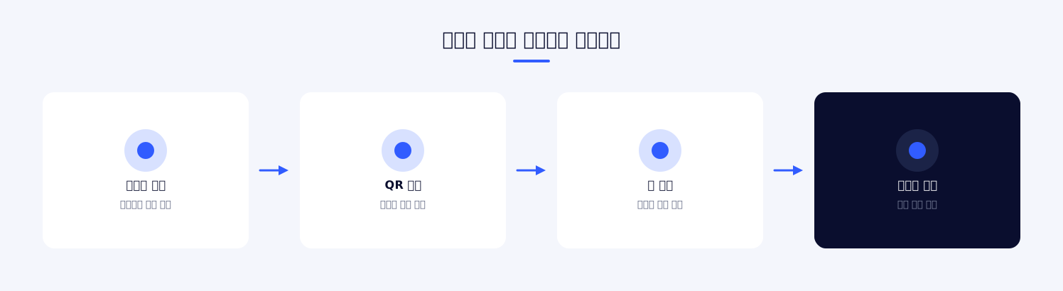
The first thing we drew in designing the app was not a screen but the user's path. They pick up cups at home, go out and find a collection machine, stand in front of it and verify, put the cups in, check the result and turn away. Of these, the points where the app is involved are when finding the collection machine, when verifying, and when checking the result.
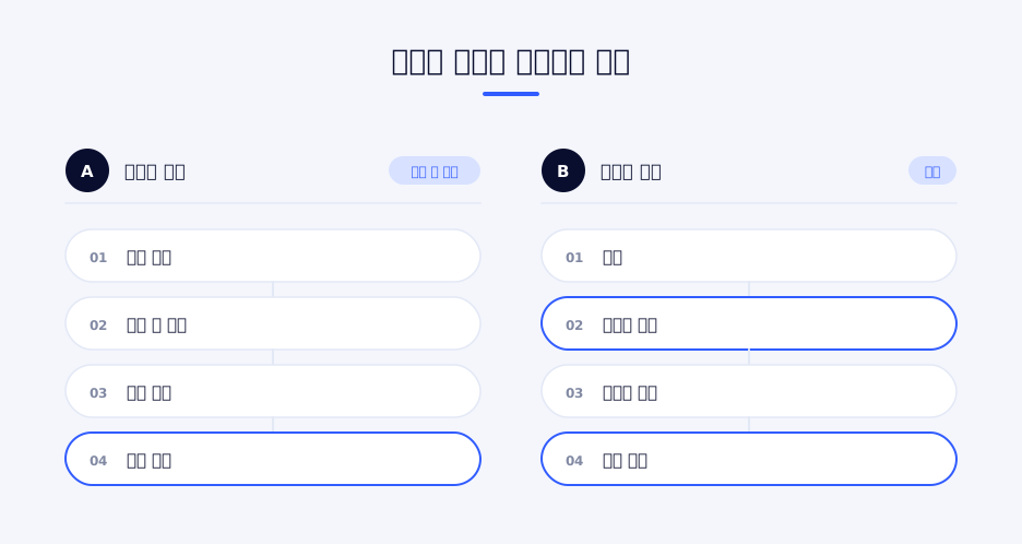
We made each of the three points the shortest possible path. Finding a collection machine is one step from home, and the verification screen is also reached in one step from home. The earning result is visible right on the home screen without having to go looking for it. We kept to the principle of including many features while not burying the three most frequently used ones deep.
Earning and using points
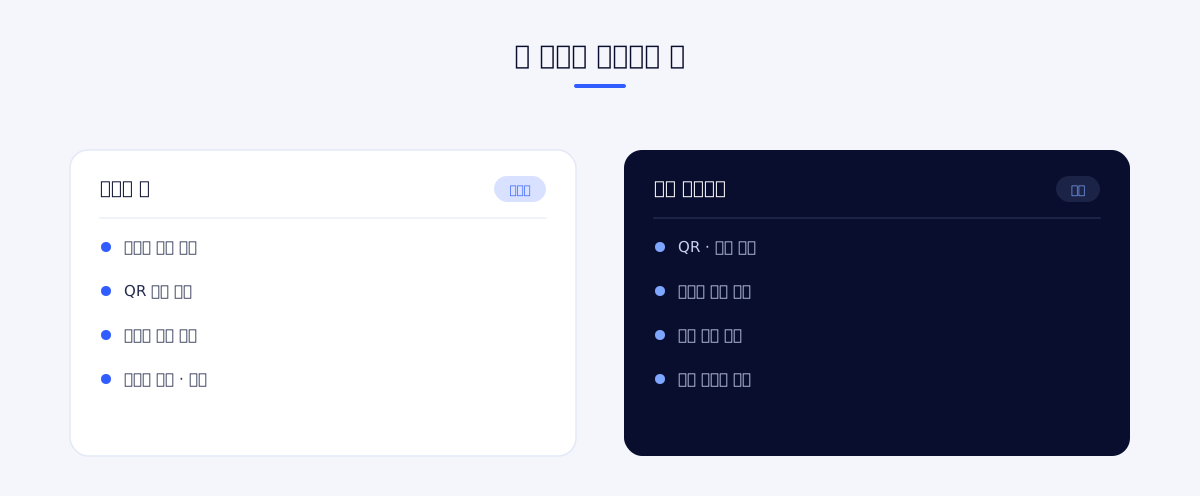
When a return is recognized at the collection machine, points are credited to the app account. Users check their earning and usage history in chronological order and use points to buy gifts or convert them into external points. Conversion is supported for several partners rather than just one, and each conversion path is built as a separate screen.
The app also includes a feature for sending points to another user. It is for cases where points are pooled and used by a family or a group of acquaintances.
Screen layout
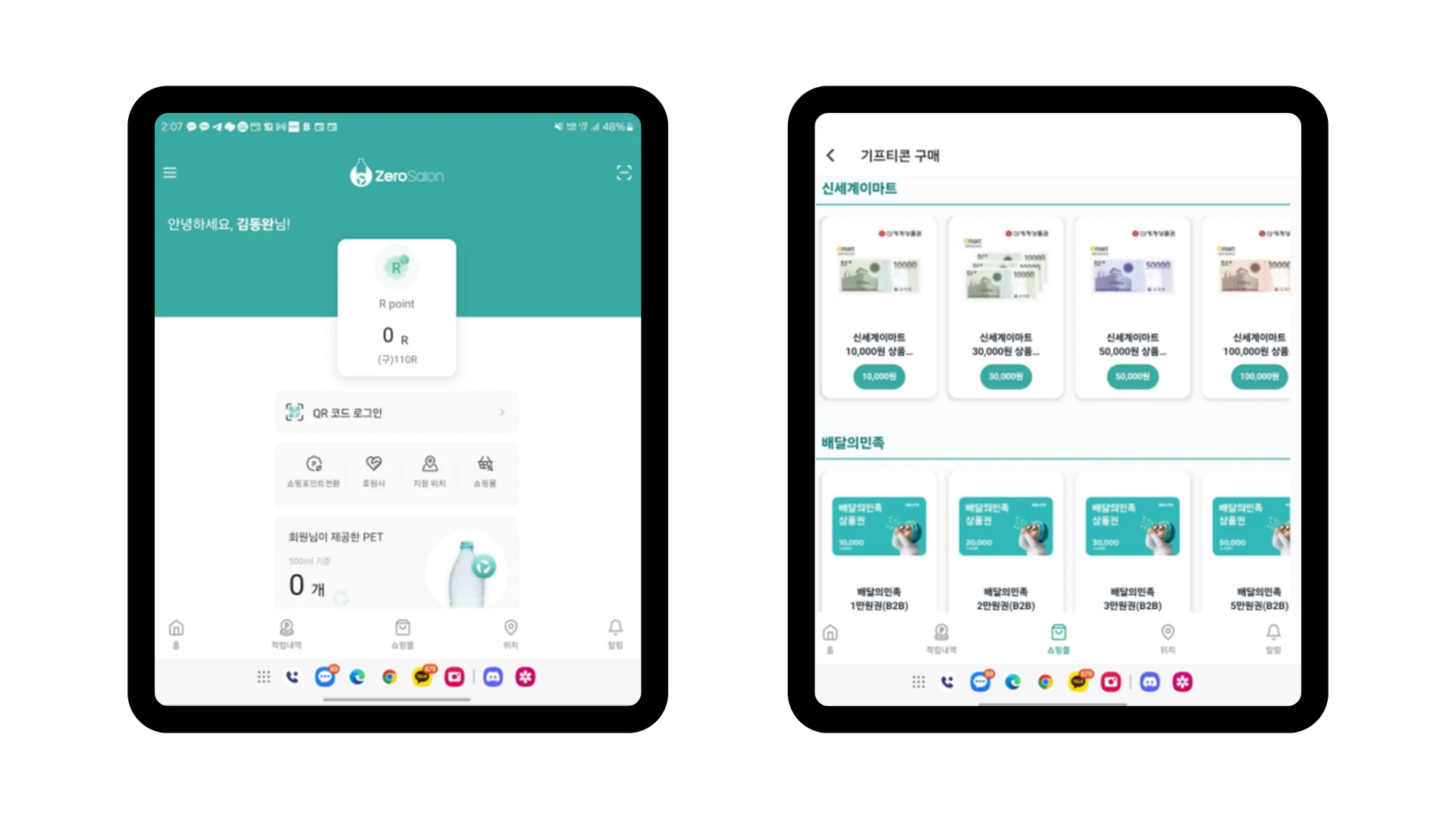
The first screen is centered on points. The point balance is shown first, followed below by event banners, shortcuts to the main features and recent earning history. This is because most of the reason users open the app is to check "how much has built up."
The bottom tabs hold home, map, history and my info, and the remaining features are placed in the side menu. The four most frequently used are reachable in one step, while occasionally used features such as sign-up, verification, terms and the customer center are put inside the menu.
Screen navigation is separated into before and after login. The sign-up and verification process is kept as an independent flow, and on completion it hands over to the main flow. Even if the app is closed in the middle of verification, the next launch returns to the same point.
How we worked
As we carried out development and maintenance together over one year, the nature of the work differed greatly between initial development and later operation. Early on, we first completed the core flows of sign-up, verification, earning and usage, because the service holds together only when these four run without breaking.
After entering the operation phase, the nature of the requests changed. Many requirements were closer to content than to features, such as adding a new conversion destination, running events and revising guidance text. Handling such requests through a release each time ties the pace of operations to the development schedule. Moving content to server-side management and applying OTA updates was the main work of this period.
Operational content
In an environmental business, sponsorship and partnerships move together. Because publicizing participation itself is part of running the service, sponsorship information and an introduction to the business are also available inside the app. If users can see where their actions lead, the motivation to participate does not stop at points.
The main banner, notices, usage guides, the customer center and sponsorship information are downloaded from the server and displayed. Notice bodies can be written in HTML, so they can include images and formatting. Opening an event or changing guidance text does not require waiting for app store review.
The usage guide is provided in several steps. First-time users have to be able to check how to use the collection machine in the app beforehand so that they are not lost on site.
Main features
Collection machine-linked point earning
When the collection machine recognizes a return, points are credited to the app account. Users see the same result whether they look at the collection machine screen or the app. If crediting is delayed, users take it as a failure, so it was important to make the earning result visible in the app immediately.
Map-based collection machine guidance
Nearby collection machines are shown on a map centered on the current location. A Korean map service is integrated to show actual road and building information alongside. Location permission is used only for map display, and the collected location is not sent to the server.
QR and camera recognition
The app displays a QR code to identify the user to the collection machine, or reads a code with the camera. In front of a collection machine the lighting is uneven and the angles vary, so recognition performance matters. We applied a high-performance camera module to reduce situations where the line backs up because of recognition failures.
Point history management
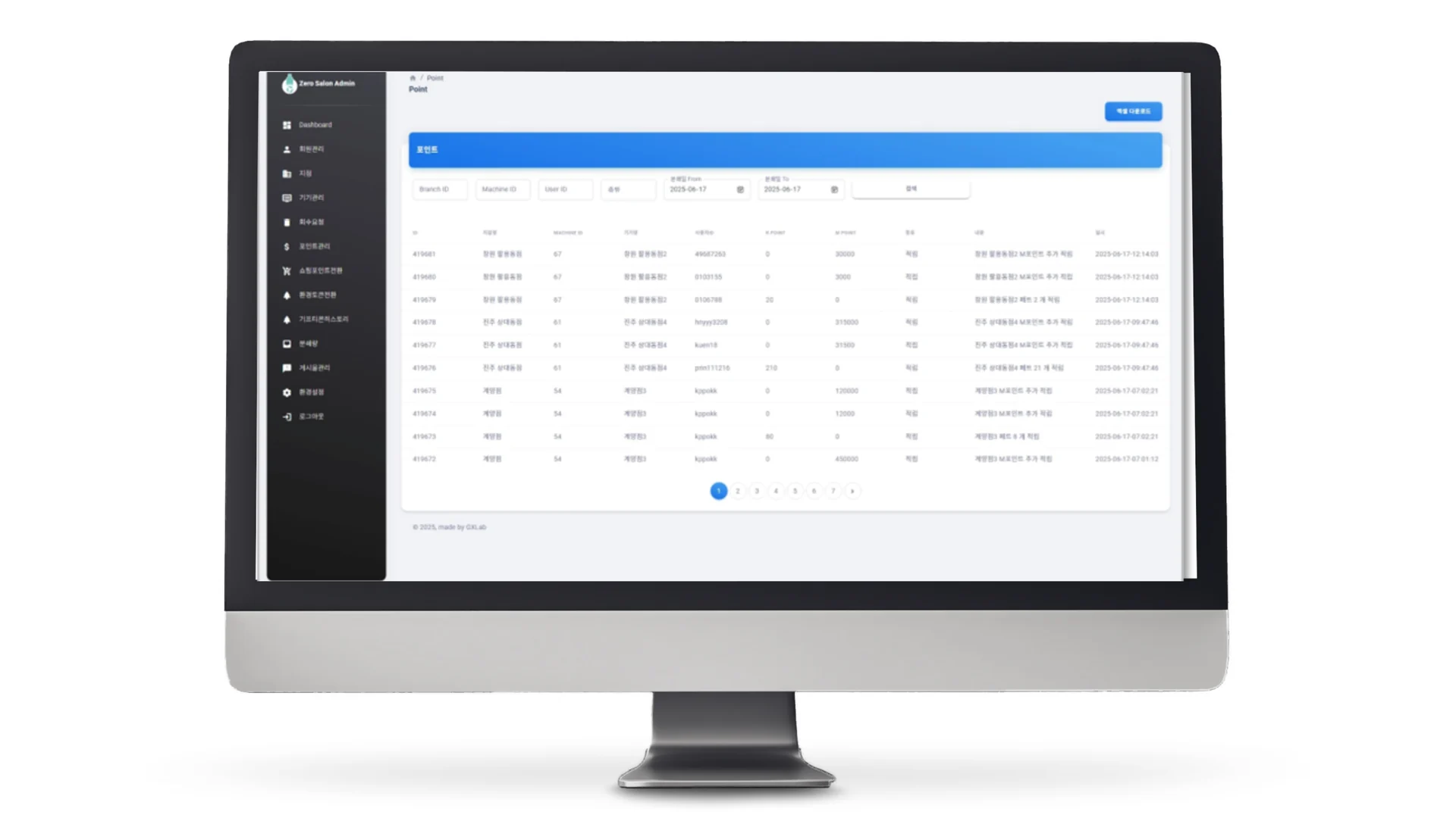
Earning and usage history is shown in chronological order. Because it records which collection machine gave how much and when, users can check for themselves when they feel a credit is missing. The remaining points and the items they can be used for are shown on the same screen.
Gift purchase and conversion
Points are used to buy gifts or are converted into external points. Because there are several conversion destinations, each procedure is built as a separate screen, and purchase and conversion history can be looked up separately. The more paths there are for points to actually be used, the stronger the motivation to earn them.
Point transfer
Points held are sent to another user. Given that the amount an individual collects in this service is not large, there was demand for pooling points to use them. Transfer history is also kept on record, so where and how much went out can be checked. We made it a principle that features dealing with points leave a history without exception.
Identity verification and terms management
The identity verification procedure and terms consent are divided into step-by-step screens. The purpose is explained for each consent item, and required and optional items are distinguished. Screens that deal with personal information may change in content, so the text is managed on the server.
Banners and notices
The main banner and notices are downloaded from the server. Notice bodies support HTML rendering, so they can include formatting and images. Operators replace content without an app update.
Purchase and conversion history lookup
Gift purchase history and point conversion history are each looked up separately. They are kept apart from earning history because the context in which users look for them is different. The screen needed when checking "how much has built up" is different from the one needed when checking "what did I exchange last time."
Coupons and events
Coupon issuance and use are supported. Events that give extra benefits during a specific period or at specific collection machines can be run with coupons, which makes it possible to target periods or regions where participation is low.
Customer support
The customer center, usage guides and sponsorship information are placed inside the app. If users have to go out to an external channel to make an inquiry, most of them simply leave. The app is arranged so that frequently asked questions are resolved first on the guide screens.
Partner store information
Partner store information is provided along with collection machines. The store detail screen shows the location and guidance, so users find places where they can use points inside the app. Earning and using have to be connected within the same app to avoid points simply piling up and sitting unused.
Splash and first entry
The splash screen right after app launch checks the login state and whether a mandatory update is required. If a user opens the app in front of a collection machine and an update prompt appears first, the flow is broken, so mandatory updates and optional updates are handled separately.
Core design The three most frequently used actions (finding a collection machine · verification · checking credits) are placed so they are reachable in one step from home.
4. Outcome
The app recorded more than 10 million cumulative downloads. Shortening the user's path to fit the condition of being an app used in front of a collection machine led to frequency of use.
By creating the immediate reward of earning points, we made recycling participation continue as a repeated behavior rather than a one-off campaign. Put a cup in and points accumulate on the spot, and the accumulated points are actually used for gift purchases and conversion into external points. The fact that the reward was tangible rather than abstract drove participation.
By arranging for finding a collection machine on the map, verifying with QR and checking earning history to be completed in a single app, we reduced the time spent on site. A service that requires staying long in front of the collection machine creates lines, and when lines form, participation drops.
Thanks to managing operational content on the server and applying OTA updates, events and guidance could be reflected quickly during the one-year operation period. There were fewer cases of operations being held up by waiting for app review.
Having the same team develop the app and the kiosk also affected the result. Because the two pieces of software share accounts and points, less time was spent agreeing on integration specifications. When a problem occurred on site, we could also look at both sides together to judge whether it was a problem with the app or with the equipment.
Including one year of maintenance in the contract also contributed to the continuity of the service. Because the same team responded not just right after launch but throughout the period in which operations settled in, improvements could be reflected while keeping the intent of the initial design.
From April 2025 to April 2026, we handled development and maintenance continuously, steadily reflecting the requirements that came up during operation and OS updates.
5. Technical Stack
Mobile
We developed for Android and iOS together on React Native and Expo. The app is written in TypeScript, and the UI is built with the Gluestack UI component system. Screen navigation uses the stack and drawer structure of React Navigation, with navigation separated into before and after login.
Device features
This includes the camera (QR and barcode recognition), location permission and integration with a Korean map service. A high-performance camera module was applied separately to secure the recognition rate. Notices and guidance content are displayed with a webview and an HTML renderer.
Data / Validation
The API is called with Axios, and input values are validated with React Hook Form and Zod. Login information and settings are kept in local storage. The API is managed in modules divided by function, such as authentication, banners, coupons, notices, points, collection machines and products.
Deployment / Operations
The app is deployed through the Expo build pipeline, with OTA updates applied. Text revisions and simple screen changes are reflected without store review. While handling one year of maintenance, we processed OS update responses and improvement requests raised during operation through this path.
Content rendering
Notices and guidance are downloaded from the server as HTML and rendered in the app. Because they can include formatting and images, operators can create content without a separate tool, and the app is not involved in the content. Some screens are displayed in a webview, so the user does not leave the app even when an external page has to be shown as it is.
Criteria for technology choices
The success of this app depends on how quickly things finish on site. So the technology choices were also aligned to speed and operational flexibility. We chose a cross-platform framework in order to keep up with the features of both operating systems at the same time, and we included OTA updates because we expected frequent changes during operation.
Conversely, for parts that directly determine the user experience, such as recognition performance, we did not rely on the built-in functionality and attached a dedicated module. The approach is to keep the whole simple while spending where it affects what users feel.
App structure
Screens are divided by feature, and shared components are separated out. Elements repeated across several screens, such as dialogs, the drawer menu and the point display, are kept shared, while screen-specific logic is managed by each screen. Because the app has many screens, without organizing the shared elements first the same UI splits into several copies.
API calls are also divided into modules by function. Authentication, points, collection machines, notices, banners, coupons and products are each a module, and common settings are managed in one place. Even if the server address or header policy changes, only one file needs to be fixed.
Problems we dealt with during implementation
Timing of permission requests. Asking for location and camera permissions all at once right after app launch raises the denial rate. We adjusted the order so that the request is made on the screen that uses the feature, with an explanation of why it is needed first.
Recognition failures. The lighting and angle in front of a collection machine cannot be controlled. We provide both paths, QR display and camera recognition, so that if one does not work the user can switch to the other.
Content change cycle. Operational text and events change frequently, but app releases are slow. We moved content likely to change to a structure where it is downloaded from the server, separating the release cycle from the operations cycle.
Point reliability. Points are the value users look at most sensitively. Earning and usage history can always be looked up, and it is refreshed on screen entry so that the balance and the history do not diverge.
Duplicate sign-ups. When points have real value, there are attempts to create multiple accounts. We put identity verification into the sign-up flow but split the steps so that basic features can be used without verification, balancing the barrier to entry against abuse prevention.
OS policy changes. Over one year, the permission policies and build requirements of the two operating systems change several times. Even with a cross-platform framework this work cannot be avoided, so we handled it regularly during the maintenance period.
One year of maintenance. OS updates and policy changes continue even after development ends. We included the maintenance period in the contract so that the same team responded after release as well.
6. Project Information
| Item | Details |
|---|---|
| Project name | Zero Salon App (Plastic → Points) Development |
| Scope | App development and one year of maintenance |
| Technologies | React Native, Expo, TypeScript, Gluestack UI, Naver Map, OTA updates |
Planning a similar project?
Share your requirements and timeline, and we will outline a suitable scope and setup.
Comments 0
Be the first to leave a comment.